Drawn to It: How Famous Maps Quietly Decided Where You Vacation
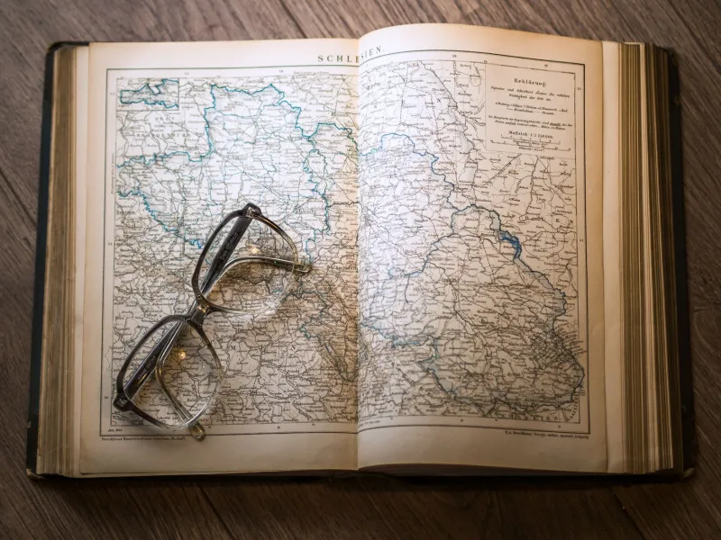
Pull an old Rand McNally off a shelf at a thrift store sometime. Flip to Europe. Notice which cities get the big bold type, the little airplane icons, the red-star treatment. Then ask yourself: is it a coincidence that those are exactly the cities you've always wanted to visit?
Probably not.
Maps don't just describe the world. They make arguments about it. And for most of the twentieth century — long before algorithms started curating your travel feed — the atlas sitting on your parents' coffee table was the most powerful travel influencer on earth.
The Weight of a Bold Font
Cartographers will tell you that every design decision is a choice about emphasis. Font size, line weight, color saturation — these aren't neutral. When a mapmaker renders Paris in large capital letters and a neighboring town in tiny gray italics, they're communicating relative importance. Travelers internalize that hierarchy without realizing it.
"A city that appears physically larger on a page feels more significant to the reader, even if the cartographer's choice was purely aesthetic," says one travel historian who studies tourism geography. "That perceived significance becomes a reason to visit. The map doesn't just reflect demand — it creates it."
This is what you might call the Atlas Effect: the feedback loop between how a place is represented on a map and how many people subsequently show up there. Over decades, that loop compounds. More visitors means more hotels, more hotels means more infrastructure, more infrastructure means a bigger airport symbol on the next edition of the map. The place grows into the importance the map assigned it.
Mercator's Long Shadow
You've probably heard the critique of the Mercator projection — how it inflates the size of landmasses near the poles, making Greenland look roughly the size of Africa when Africa is actually fourteen times larger. What gets discussed less often is how that distortion shaped American travel imagination.
For generations of US students, the world map on the classroom wall was a Mercator. Europe appeared large, prominent, and central. Sub-Saharan Africa, despite its actual scale, looked manageable, peripheral. Southeast Asia was compressed into a corner. The subconscious effect on where Americans felt comfortable traveling — where felt "big" and "important" enough to justify a long flight — is hard to measure but impossible to dismiss.
Tourism economists have noted that European destinations have historically attracted a disproportionate share of American international travel dollars relative to regions of comparable beauty, history, and accessibility. Some of that is explained by cultural familiarity and language. But some of it, researchers quietly suggest, may trace back to a rectangle on a classroom wall.
When a Picture Book Becomes a Pilgrimage
The 1985 publication of a certain famous atlas — you know the one, the big blue National Geographic edition that lived in dentist offices for a decade — didn't just document the world's great natural wonders. It effectively issued a travel checklist.
The Grand Canyon photograph on page 48 sent visitors. The aerial shot of the Great Barrier Reef sent more. Patagonia, the Serengeti, the Norwegian fjords — each image was a quiet instruction: go here. Tourism boards in those regions watched visitor numbers climb in the years following major atlas and travel guide publications with the kind of correlation that isn't coincidence.
What didn't get the full-page spread? The equally dramatic canyon country of southern Utah beyond Zion. The reef systems off Belize. The fjords of Chilean Patagonia, which mirror Norway's in almost every geological detail. Those places existed. They were beautiful. They just didn't make the cut — and for years, they remained genuinely uncrowded as a direct result.
The Unmarked Regions
Here's the thing about maps: what they leave out is just as influential as what they include.
Travel researchers studying overtourism have found that destination crowding often follows representation patterns almost exactly. The towns and parks that appear most frequently in widely distributed travel imagery — whether in atlases, guidebooks, or later on social platforms — absorb the bulk of visitor traffic, while adjacent areas of comparable quality sit nearly empty.
The Cinque Terre villages in Italy are a perfect case study. Five towns, photographed relentlessly, now so crowded in peak season that the Italian government has considered implementing timed entry systems. Meanwhile, the villages of the Val di Vara, just inland, offer similar coastal-mountain landscape character, genuine local life, and almost no tourist infrastructure — because no famous map ever pointed a bold arrow at them.
The same pattern repeats in the American West. Arches National Park in Utah averages over 1.5 million visitors annually and has implemented a reservation system to manage the crush. Canyonlands National Park, 30 miles away, offering arguably more dramatic and varied terrain, sees roughly a third of that traffic. The difference? Arches has the famous arch. The arch appeared on the map. The map sent the people.
What We Choose to Draw
Some cartographers are actively wrestling with this responsibility now. A small movement within the field — sometimes called "counter-cartography" — is experimenting with maps that deliberately de-emphasize famous landmarks and amplify overlooked regions. The goal isn't to trick travelers. It's to suggest that the world is larger than the places that have always gotten the big bold type.
Tourism boards in lesser-visited regions are taking notes. Several European countries have launched campaigns built around the explicit premise that their most photographed sites are not their best sites — that the real experience lies in the places the old atlases ignored.
For travelers, the lesson is simple and a little unsettling: the destinations you've always dreamed of visiting may be dreams that were handed to you. The map you grew up with made certain choices, and those choices became your desires.
That doesn't mean those places aren't worth visiting. Paris is Paris. The Grand Canyon is the Grand Canyon. But it's worth asking, occasionally, whether the places you've never considered might be equally extraordinary — and whether they're empty simply because no one ever bothered to make the font bold enough.
The atlas shaped the journey. Now you get to decide if you're still following its directions.