Everything Your Map Got Wrong (And Why That Changes Everything About How You Travel)
There's a map somewhere in your past — maybe it hung in a classroom, maybe it was the default background on your first laptop, maybe it's still tacked to the wall above your desk right now. It looks authoritative. Official. Like the final word on how the world is arranged. And it has been, very quietly, misleading you for decades.
This isn't a conspiracy. Nobody sat in a back room scheming to warp your sense of global geography. But the result is the same: most Americans carry around a fundamentally distorted mental image of the planet, and that distortion shapes travel decisions in ways we rarely stop to examine.
Let's talk about it.
The Mercator Problem (It's Bigger Than You Think)
In 1569, a Flemish cartographer named Gerardus Mercator solved a genuinely difficult problem. Sailors needed maps where compass bearings appeared as straight lines — a critical feature when you're navigating open ocean. To pull that off, Mercator had to stretch the map as you move toward the poles. It worked brilliantly for navigation. The side effects, however, were significant.
On a Mercator projection — which is still the default map style across most of the internet, including early versions of Google Maps — landmasses near the equator get compressed while those near the poles balloon outward. The practical result is surreal once you actually see it. Greenland looks roughly the same size as Africa on a standard Mercator map. In reality, Africa is about 14 times larger. You could fit the continental United States into Africa roughly three times over, with room left for India.
Alaska appears to dwarf Mexico on most maps most Americans grew up with. In reality, Mexico is larger. Europe looks like a substantial, central landmass. In terms of actual area, it's smaller than either the US or China, both of which appear to be off to the sides, almost peripheral.
None of this is subtle. These are massive distortions of scale. And they've quietly informed which parts of the world feel "big" and "important" to generations of Western travelers.
When Borders Lie About Culture
Size distortion is only one layer of the problem. Political boundaries — those clean, confident lines dividing countries on every map you've ever seen — carry their own brand of fiction.
Take the African continent. Many of the borders you see on a modern map of Africa were drawn by European colonial powers at the 1884 Berlin Conference, where diplomats quite literally sat around a table and divided up a continent most of them had never visited. Those lines cut straight through ethnic homelands, split linguistic communities in half, and lumped together groups with entirely different histories and cultures. When you look at a map today and see "Chad" or "Nigeria" or "the Democratic Republic of Congo," you're looking at the administrative legacy of that conference — not a reflection of cultural or geographic reality on the ground.
This matters enormously for travelers. If you plan a trip to "West Africa" based on how the map parcels it up, you might miss the fact that the Hausa cultural world stretches fluidly across northern Nigeria and southern Niger — that a market town in one country is more culturally continuous with the town across the border than it is with a city three hundred miles south in the same country. The border is real in a legal and logistical sense. Culturally, it's a suggestion.
The same dynamic plays out in Central Asia, the Balkans, the Middle East, and across Southeast Asia. Maps present clean divisions. The actual human geography underneath is layered, overlapping, and far more interesting.
Distance Feels Different When You Recalibrate
Here's where this gets practically useful for trip planning.
Because Mercator maps compress equatorial regions, destinations near the tropics tend to feel more distant and more "remote" than they actually are in terms of travel time and accessibility. Meanwhile, the visual weight given to northern landmasses makes Europe — already close in cultural familiarity for most Americans — feel even more central and approachable.
One way to recalibrate: spend some time with a Winkel Tripel projection, which is what the National Geographic Society uses for its reference maps. It's not perfect (no flat map of a sphere ever will be), but it gives a much more accurate sense of comparative landmass sizes and distances. Another option is the Authagraph projection, a Japanese design that won the country's Good Design Award in 2016 for its unusually accurate representation of relative sizes across the globe.
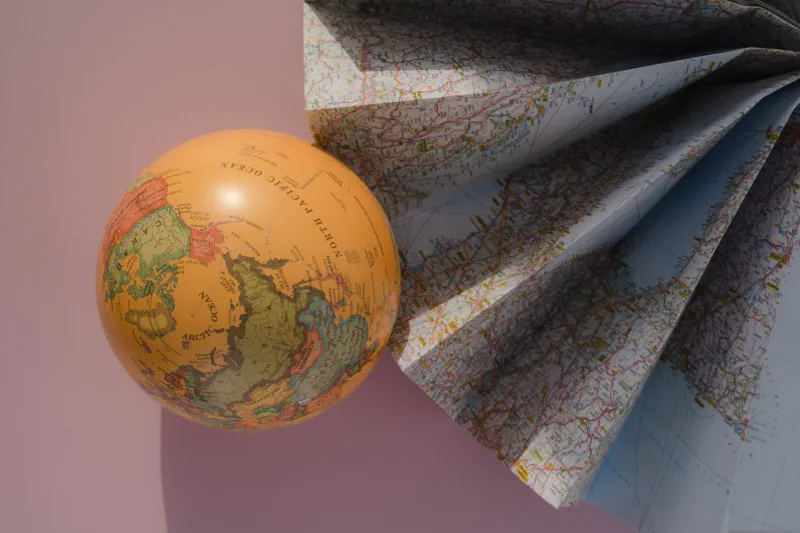
Or, go analog. Spin a physical globe and let your finger trace actual distances. The fact that Nairobi is closer to Mumbai than it is to London suddenly becomes visceral in a way that no flat map communicates. Southeast Asia's sheer geographic sprawl — the distance between Hanoi and Bali is roughly equivalent to the distance between New York and Denver — registers differently when you're running your hand across a curve rather than a flat surface.
What This Means on the Ground
None of this is purely academic. The way we internalize maps shapes which destinations feel "worth it," which seem exotic or remote, and which cultural assumptions we carry with us when we arrive.
If you've always thought of Africa as a single, vaguely defined destination rather than a continent larger than the combined area of the US, China, India, and most of Europe — maps did that to you. If Southeast Asia feels like a compact cluster of similar countries rather than a vast, extraordinarily diverse region — maps did that too.
The recalibration, once you start it, tends to snowball in the best way. Suddenly the Ethiopian Highlands feel less like "the middle of nowhere" and more like a distinct highland civilization that's been continuously inhabited for millennia. The sheer scale of the Amazon basin stops being abstract. The Silk Road stops being a romantic metaphor and starts being an actual, measurable swath of the planet connecting cultures across thousands of miles.
Travel gets richer when the map in your head gets more honest.
A Practical Reset Before Your Next Trip
Before you start planning your next destination, try this: pull up a size-comparison tool like thetruesize.com, which lets you drag country outlines across a Mercator map to compare actual landmass sizes. Drag the US over Africa. Drag Greenland down to the equator and watch it shrink. It takes about four minutes and it will permanently change how you look at every map you encounter afterward.
Then look up the political history of the borders in your destination country. Understand whether those lines reflect something organic about the place or whether they were imposed by an external power for administrative convenience. It won't change your itinerary, necessarily — but it will change what you're paying attention to when you get there.
The atlas has always been a starting point, not a final answer. The world is bigger, stranger, and more continuous than any flat projection can capture. That's not a problem to solve. It's an invitation to keep looking.